dear data 01
Last October, I visited MoMA and stumbled upon a curious art project called Dear Data. It’s a collection of 104 postcards created by artists, Stefanie Posavec and Giorgia Lupi, over the course of an entire year. Every week, they independently collected data from their daily lives and visualized it in a postcard to send to the other.
Select pieces from the project were displayed upright in a glass frame so the viewer could see both sides. I remember going back and forth from one side to the other trying to make sense of these postcards. They were mind-blowing!
I had worked with data extensively before, but here was this fresh take on data visualization. And I wanted to try it.
Enter Ben Goldberg.
Ben and I were colleagues at thredUP and we started a short-lived book club together. Although we’ve never met in-person, it was an absolute no-brainer to invite him to “Dear Data” with me (especially after the first person I asked didn’t reply). In all seriousness, Ben is just that kind of person – he’s accountable and always willing to dive into something new. And if it’s not completely obvious from his postcard, he is thoughtful, analytical, and puts an impressive amount of effort into even the littlest of things.
I present to you, our first edition of Dear Data postcards.


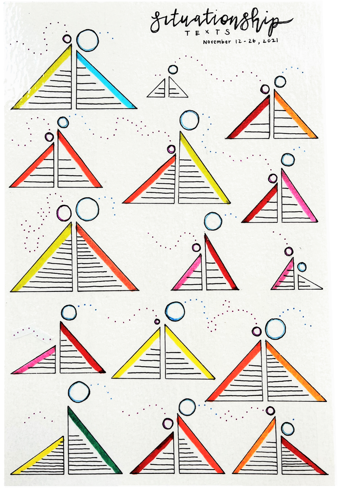
Eunice: Situationship Texts
DATA COLLECTION
For my first postcard, I visualized data extracted from a text conversation that occurred over a 15-day period. I extracted the text using Google Photos and used Excel to collect data on five attributes. In total, there were 150 data points to be visualized (2 individuals * 15 days * 5 attributes).
DESIGN PLANNING & IMPLEMENTATION
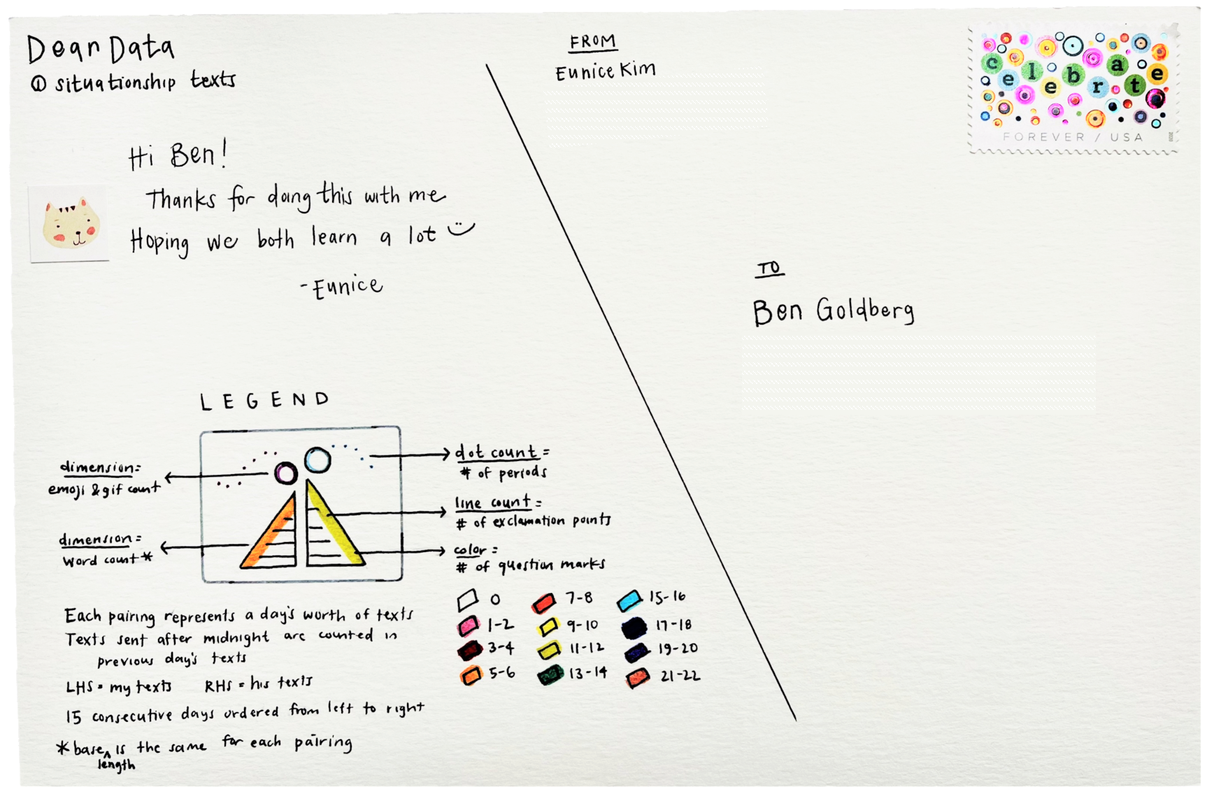
It was challenging to settle on a design because I wanted it to be both sensible and visually appealing. In the end, I decided to use circles, right triangles, dots, stripes, and colors to represent my data attributes (see table below).
Each visual element represents data pertaining to one individual on a particular day (i.e., A right triangle represents the number of words sent by one person on a single day). Visual elements corresponding to the same day were grouped and arranged to give the impression of two people sitting back-to-back.
| Attribute | Represented By |
|---|---|
| Word count | Right triangle (size) |
| Emoji/Gif count | Circle (size) |
| Full-stop count | Dots (#) |
| Question mark count | Color (key on postcard) |
| Exclamation point count | Stripes (#) |
Word Count. For the right triangles, I made each pair have the same base length so it was easier to compare data for that day. I decided against standardizing the base length across the board because the daily word count varied drastically.
Punctuation. It’s hard to see in photographs, but the dots are colored to match up with their visual grouping. It wasn’t my intention to use a stereotypically gendered color palette (where I’m represented with pink and my co-texter blue), but those happen to be our favorite colors respectively. As for the colors used to represent question mark count, I wish I had accounted for my one outlier (21 question marks) differently since brown and orange are somewhat similar and I would’ve preferred more blue-ish hues in the postcard.
Emojis & Gifs. I wanted the circles to look balanced for aesthetic purposes while upholding a semblance of visual integrity. This was challenging because I didn’t send a lot of emojis/gifs whereas my co-texter sent them frequently. When drawing the circles, I used Fibonacci numbers to determine the radius of the circle (see table below). I’m satisfied with the outcome because the method still allows comparisons to be drawn for each day.
| Emoji & Gif count | Circle radius (mm) |
|---|---|
| 0 | 0 |
| 1 | 1 |
| 2 | 2 |
| 3-4 | 3 |
| 5-7 | 4 |
| 8-12 | 5 |
| 13-20 | 6 |
Favorite emojis? Mine was 🙂 (3 instances out of 24 total emojis) and my co-texter’s was 😂 (22 out of 102 total emojis). I’d like to think I’m hilarious.


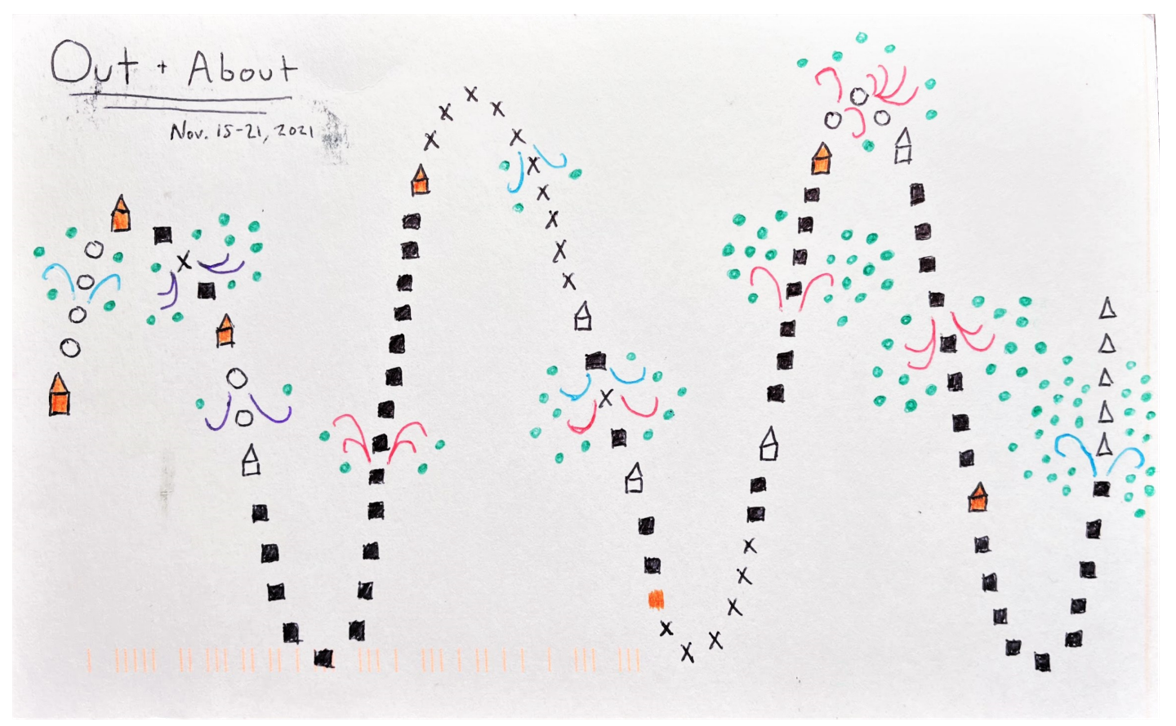
Ben: Out + About
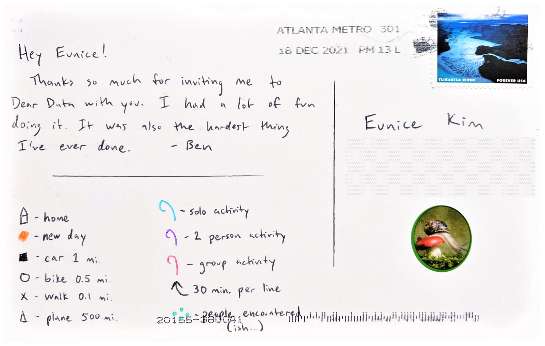
Since Ben had a lot going on that week, he decided to track his activities and modes of transportation using an app called Strava.
I love how simplified and intuitive his visualization is. The way it snakes from top to bottom reminds me of a treasure map, which really captures the idea of movement. My favorite elements in “Out + About”:
- New days are highlighted in orange
- The flair with which activities are illustrated
- The scientific unit used for people encountered
Ben and I agree that the fun part of looking at these postcards is interpreting the story behind the data visualization. The happenings in our lives aren’t as simple as a couple of shapes and colors on a piece of paper – they can be rich, complex, and emotional. These postcards abstract all of that away, which can make them just so much more intriguing.
Please note: I wanted to request a write-up to accompany “Out + About”, but felt it would be too big of an ask. Can’t take advantage of Ben’s kindness - especially if I want a second run of Dear Data!
We hope you enjoyed our postcards and are inspired to make your own!
